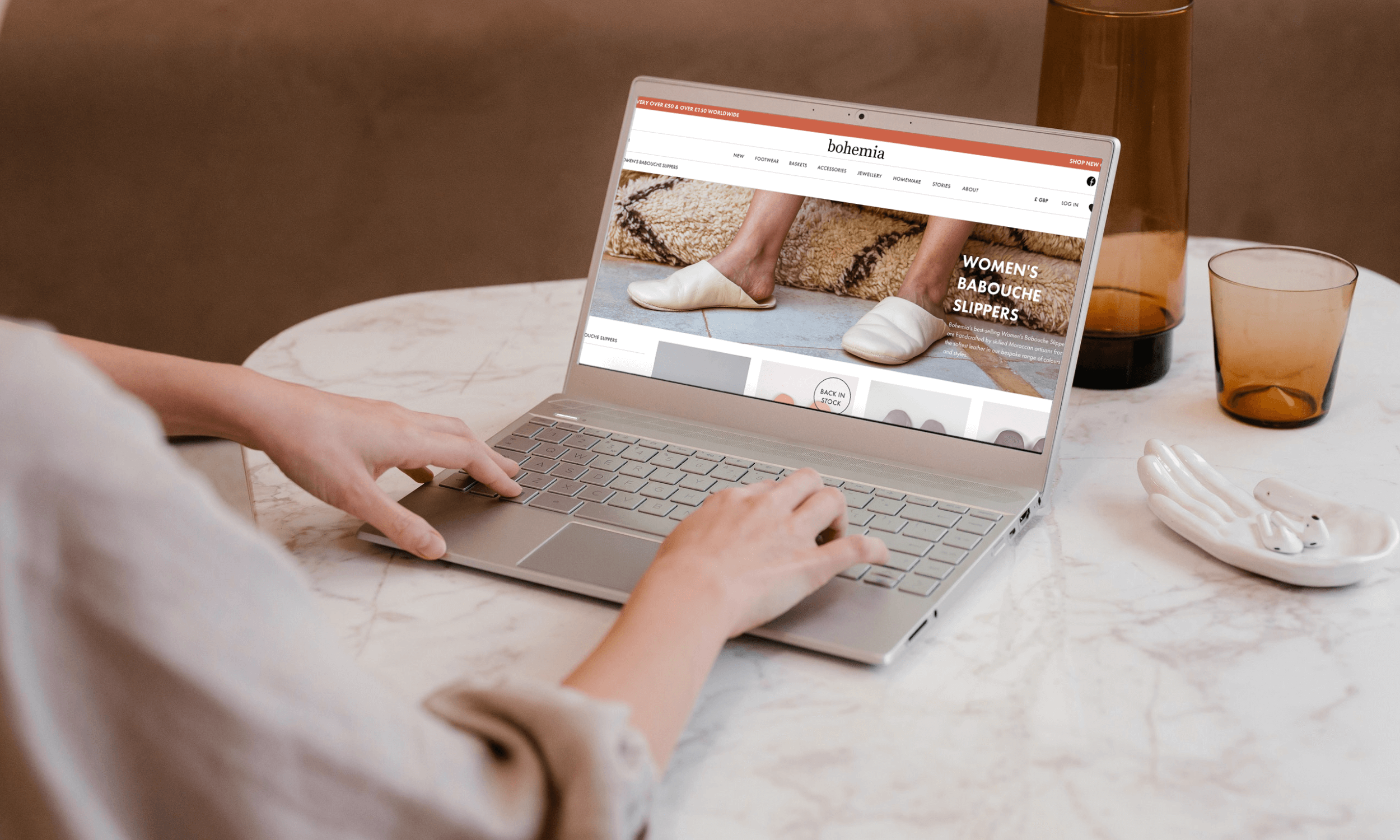
Bohemia Design, ethical e-commerce
Introduction
Bohemia Design is an e-commerce retail and wholesale store dedicated to promoting slow craft and ethical consumerism. Working as brand manager in a small team, I assumed UX responsibilities and collaborated with both colleagues and an external web agency to identify customer pain points before developing and iterating solutions.
Over the course of a year, I undertook many different UX projects to both improve the customer experience and contribute to business goals. This work was undertaken alongside key responsibilities including branding, marketing, and content management. Here, I will explore one particular UX project in detail.
Brief
As a brand manager and UX designer for an e-commerce business, the objective was to create a smooth customer journey that converted to sales and repeat purchases. Bohemia Design operates both B2C and B2B which meant that there were two different audiences and journeys to consider.
Throughout the course of a year, I worked to understand these audiences, what problems they were facing, and how these could be solved. UX projects included improving accessibility, developing a new way to gather and process wholesale stockist applications, and redeveloping and designing pop-up flows. A particular project which is explored here was to improve how users could select and see sizing information for key products.
Client
Bohemia Design
Timeframe
September 2021 – February 2022
My Role
UX Designer (approx 30% of role)
Primary Tools
Adobe XD | Shopify Plus
Problem Statement
Bohemia customers need to be able to easily see and select available sizes for products they want to buy so that they don’t get frustrated and waste their time if their size is not in stock. We will know this to be true when there are less customer questions about sizing and out of stock queries.
Design Thinking Process
Discover
Understanding the Problem
Informal interviews were conducted with staff who manage customer service and feedback. A common reason for customers making contact was regarding slipper sizing and slipper stock. Moroccan slippers are a core collection for the business and are a best-seller. The volume of questions from retail customers around sizing and whether sizes were available indicated that more could be done to make the user journey to purchasing slippers easier.
A competitive analysis was conducted before considering specific examples of how product sizing is tackled by similar e-commerce stores. Alongside this, e-commerce best practice regarding product pages and sizing was conducted with Shopify and Baymard Institute providing particularly relevant insights.
"Reducing customer effort on the product page, even if only by a few clicks, can have a significant effect on conversions" – Shopify
“When size options are located within a drop-down menu, they are essentially hidden by default until users interact with them” – Baymard Institute
Bohemia Design previous product page - dropdown variant picker
Competitor Analysis – product pages with size variants. From top clockwise: The Citizenry, Everlane, Nkuku, and Anthropoglogie
Define
With the problem and context becoming clearer, it was important to revisit Bohemia users to ensure that the customer was at the heart of every decision. Informed by Shopify data, Google Analytics, and social media analytics, two personas were developed to represent retail customers.
Ideate
User flows and wireframes were created to explore the options and different styles that could be applied to size variants on product pages.
User Flow
Existing user flow. Highlighted red action indicates where a click and user action could be removed
Wireframes
Three designs were developed for the size variants across mobile and desktop.
Design 1
Design 2
Design 3
Consulting with the Bohemia team, it was agreed to proceed with Design 1 as it would allow for more variation in terms of text length and it was a good fit for the style of the website.
Test & Iterate
Collaborating with the team, which consisted of a project manager, UX Designer, and developer at an external web agency who build and implement changes to Bohemia’s websites, the designs were reviewed and discussed further. It was agreed to roll out Design 1 on the retail site which is where the majority of customer feedback regarding sizing was coming from. Once the success of the rollout was determined on the retail site, applying the update to the wholesale sites would be considered.
The project would be undertaken in two phases:
The first phase was to roll out the button design for size variants and keep sizing information under ‘Product Info’.
The second phase would introduce a size guide link and information beside the variant buttons. During phase one coding issues delayed rollout, however, the changes went live following further development.
Results
Over the period of a month, the product pages were performing well and customer queries around slipper sizing and stock requests had vastly reduced. The design (outlined below) also addressed out of stock signalling to keep this process clear and easy for the user. Out of stock requests were submitted in a slightly higher volume than before, indicating the success of this aspect of the design.
Phase two was in development when my contract finished with the company. It was decided to use a third-party app rather than a native build, which is demonstrated on the prototype below.
Learnings & Next Steps
Overall, the project was a success with customer frustration when shopping for a key product reduced as evidenced by less feedback regarding sizing and stock questions. However, there were a few aspects that could have been improved.
The timeline for the project could have been better defined to keep things on track. Without a definitive delivery window the rollout was delayed, in part due to complex coding, which has further delayed phase two of the project.
The next step is to implement a size guide app to sit alongside the size variant buttons. This will further improve user experience as all the sizing information will be located together reducing effort to find relevant information.


