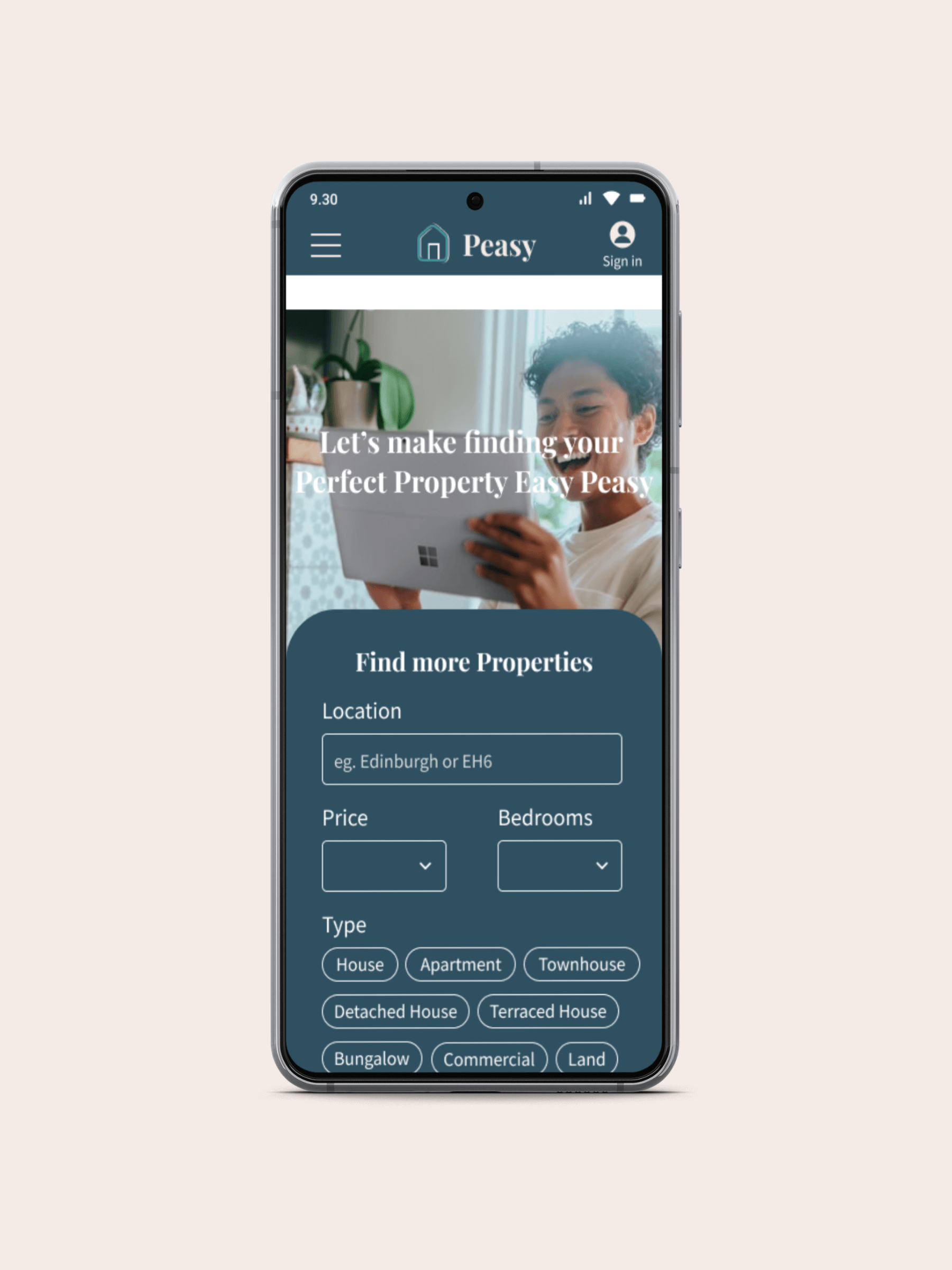
Finding your Perfect Property should be easy Peasy.
Brief
Whether it’s finding the perfect home or investing for financial security, more and more people are engaging in the real estate market.
Investing in properties is exciting, but it can be a stressful and complicated experience, and with so much information out there, where do you start? That’s where Peasy comes in; a responsive web app that provides people with all the information and expertise they need to start their real estate journey.
A speculative project as part of CareerFoundry’s UI for UX Designers course, the UX research was complete with the aim of the project to develop a user interface and visual identity for Peasy by taking a user-centred approach.
Role
UI Designer
Tools
Figma
Timeline
August – December 2021
Problem Statement
New real estate investors need a way to find properties that fit their criteria so that they can make informed decisions about their real estate investments. We will know this to be true when users easily find properties and relevant information that meet their needs.
Process
Persona
A persona was provided to inform the UI of the design, and to make sure that the user remained at the heart of the design process.
User Flows
With an understanding of the persona and user stories, user flows were mapped out for three of the key tasks highlighted in the user stories.
“As a user, I want to create a profile containing all my property criteria, so that I am recommended results most relevant to me”
“As a user, I want to be able to search and filter properties, so that I can find good matches based on my needs”
“As a user, I want to be able to contact the right people if I am interested in viewing a property so that I schedule a viewing”
Wireframes
Putting pen to paper, initial wireframes were created utilising the rapid prototyping method to start to ideate key user journeys.
Rapid prototyping enabled solutions to be mapped out and easily tweaked before creating to mid-fidelity wireframes.
Mid-fidelity Wireframes
Using Figma, mid-fidelity wireframes and prototypes were created. To develop a consistent structure and to support the hierarchy of content, an 8 column grid was implemented.
Grid 8 columns
Margin 16pt
Gutter 8pt
Device 375px x 812px
With a grid established, spacing and visual hierarchy were considered and applied to create mid-fidelity wireframes.
Mood Board
Two mood boards were created for Peasy to explore ideas for the visual style of the web app. Inspiration was drawn from interiors, book design, traditional print, and fashion to develop two distinct visual mood boards.
Mood board #1
Mood board #2
Mood board #1 was chosen as it offers a more contemporary and slightly unusual visual direction to set Peasy apart. The colour palette establishes trust and professionalism with a deep blue, while a complimentary peach inspired by the Financial Times offers a softer edge to evoke the emotional process of buying a property.
Branding & Visual Identity
The next step was to establish the branding and visual design for Peasy to apply to a high fidelity prototype. The brief outlined the following cues for the visual identity.
Message
‘Finding the perfect property shouldn’t be hard’
Style
Clean, quick, and smart
Palette
Greens, blues, and purples
Colour
A colour palette of a deep blue with complementary pinks and a teal green was chosen for Peasy. The blue and green colours evoke a sense of professionalism and trust, while the shades of pink bring an energy to the design as well as a softness.
To ensure the design and colour were balanced, the 60%, 30%, 10% rule was applied to the designs to ensure consistency throughout the app, and all colour combinations were tested to make accessibility standards were being met.
Typography
Inspired by traditional print and newspapers where people would have looked for property listings before the internet, the serif Playfair Display was chosen as the primary typeface. To contrast this, sans serif typeface Source Sans Pro was employed for subheadings and body text. This combination struck a balance between traditional and contemporary styles.
Icons
An existing icon set was used with slight alterations made. New icons and stickers made from scratch were also added to the icon set with consistency and simplicity always in mind.
High Fidelity Mockups
Applying all the defined visual language to the wireframes, high fidelity mockups of Peasy were created.


Responsive Design
Peasy is a web responsive app, and although a mobile-first approach was adopted, different breakpoints were designed including tablet and mobile.


Prototype
As a mobile-first approach was taken to design Peasy, a mobile prototype for the app was developed to explore the key user journeys that the proto-persona Rashida needed to complete.
Learnings & Next Steps
Throughout this project, I learned the importance of always going back to the brief. As I was not responsible for the UX research for Peasy, I was conscious that I needed to deliver what the research indicated and what the user needed.
Working on Peasy was a great opportunity to further develop my wireframing and prototyping skills. I also spent a lot of time considering each design decision from the emotions that could be evoked through colour selection, to the hierarchy of information. My background in art history and colour theory informed my design decisions and enabled me to create interfaces that are balanced but impactful.
There is still a lot to explore with Peasy including the development of some of the app’s features like the property comparison tool which sets it apart from competitors.
Following user and preference testing, it would also be interesting to ask more questions of Peasy. When a person has bought a property, could the app help them organise necessary next steps such as home insurance, or even provide inspiration for how to decorate and make their house a home?


